6.2. Graphics in Python
There is a very complete library in Python that can be used to plot curves. This the matplotlib library. It relies on the numpy library because curves are always plotted using arrays.
6.2.1. The plot command
Let us start with an example :
from pylab import *
ion()

x = linspace(0,2*pi)
y = sin(x) + cos(y)**2
plot(x, y)
The pylab modules will import all the function that will make Python suitable for numerical and graphical computation. It will import the matplotlib and numpy modules. To use pylab, one can either import it using the from pylab import * command or using an interactive python shell with the command ipython -pylab.
The plot command takes two parameters : the X and Y axis coordinates (if only one parameter is given, the x axis will be equal to arange(len(Y)))
Optional parameters are used to modify the way the graph is plotted. The two main parameters are the color and the shape. For example, the command plot(x,y, 'k^'), will plot triangle (signe '^') in black ('k' is for black - the 'b' is for blue). Look to the documentation for more details.
6.2.2. Other commands
To clear a graph, we use the function clf() (clear figure)
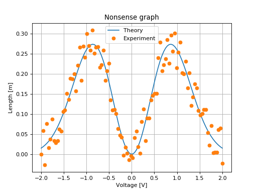
On can add a title (title("Le titre")), labels for axis (xlabel('x-axis') et ylabel). The optional label parameter is used to make a legend on a graph with many plots :
from pylab import *
X = linspace(-2,2, 100)
Y = sin(X)**2*exp(-X**2)
Y_noise = Y + .1*(rand(len(X))-0.5)
plot(X,Y, label=u"Theory")
plot(X,Y_noise,'o', label=u"Experiment")
xlabel(u'Voltage [V]')
ylabel(u'Length [m]')
title("Nonsense graph")
legend()
grid(True)
(Source code, png, hires.png, pdf)

6.2.3. Latex formula
In recent version of Matplotlib, it is possible to automatically insert Latex formula in graphs. They will be nicely converted
ylabel(u'Noise [$V/\sqrt{\mathrm{Hz}}$]')
6.2.4. Main graphical commands
plot(X,Y)loglog(X,Y),semilogx(X,Y),semilogy(X,Y)clf()to clear the graphxlabel('blabla'),ylabel('blabla'),title('blabla')xlim((x_inf, x_sup)),ylim((y_inf, y_sup))to zoom onto a part of the graphgrid(True)to plot the grid. The commandgrid(True, which='both')will plot a thin grid.figureto open a new figure (a new window). Figures are automatically numbered. You can swith to an existing figure using thefigure(n)command.subplot(nx,ny,m)to make many plots on one figure.imshow(image)to plot a matrix using false color andcolorbar()pour plot color scale.text(x,y,s)plot the textsat thex, yposition. Optional parameters can be used to center correctly the text.savefig(nom_fichier). Save the figure. The file format is determined by the file extension. We advise to usepdffor output that cannot be modified and svg if one want to modify it (using Inkscape- for example).
Screenshots are available on the matplotlib web site and can be used to quickly find the best way to plot a specific graph.
6.2.5. Using OO programmation
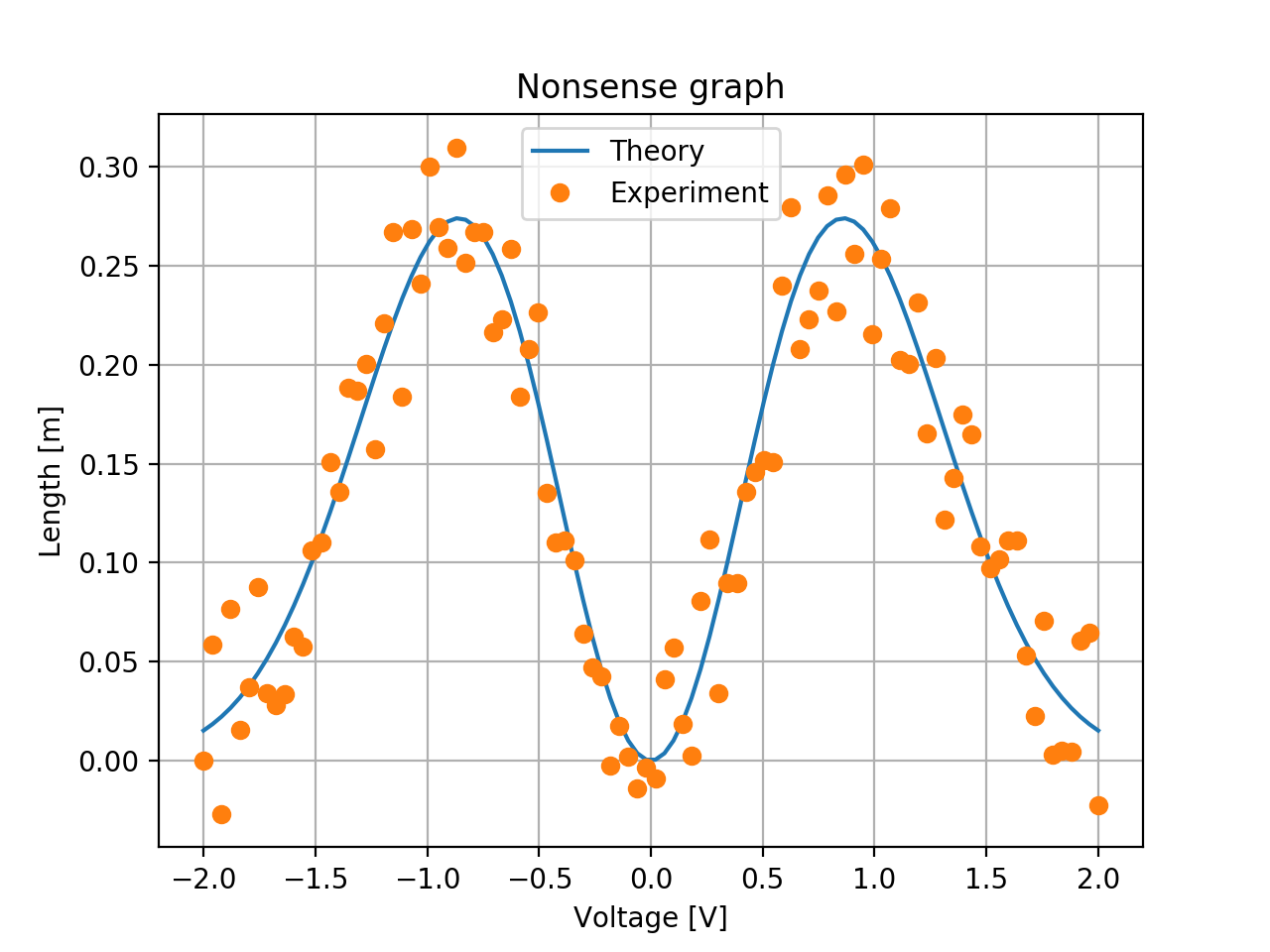
In the example above, we have used function to create a graph. However, a graph is a Python object and those function are simply shortcut the current graph.
More precisely, to create a graph, you need first to create a figure and then add to this figures axes (and axes will represent a plot). Then the usual usual command are methods of this axes. Methodes that read or write a parameter of the axes is prefixed with set or get. Functions that add an element to the plot are the same.
The example above will then be :
from matplotlib.pyplot import figure
import numpy as np
X = np.linspace(-2,2, 100)
Y = np.sin(X)**2*np.exp(-X**2)
Y_noise = Y + .1*(np.random.rand(len(X))-0.5)
f = figure(figsize=(5,3)) # The size can be specified
ax = f.subplots(1, 1)
ax.plot(X, Y, label=u"Theory")
ax.plot(X, Y_noise,'o', label=u"Experiment")
ax.set_xlabel(u'Voltage [V]')
ax.set_ylabel(u'Length [m]')
ax.set_title("Nonsense graph with object!")
ax.legend()
ax.grid(True)
f.tight_layout()
(Source code, png, hires.png, pdf)
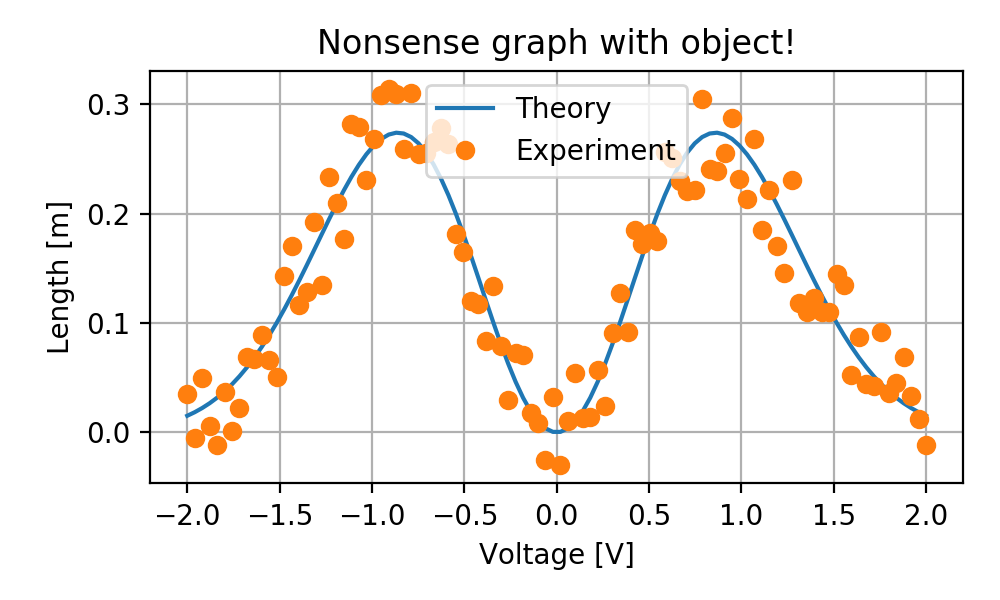
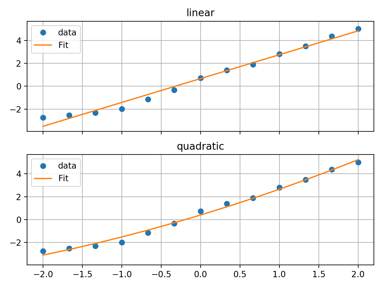
Even if using object is slightly more cumbersome, it has advantages. You don’t need to import all the functions that you will use. You can also pass the axes as a parameter for a function that will do the plot. This allow to factorize the code. For example you can think of the following function :
from matplotlib.pyplot import figure
import numpy as np
import scipy.optimize

def plot_fit(data_x, data_y, fit_function, ax):
    ax.plot(data_x, data_y, 'o', label='data')
    popt, pcov = scipy.optimize.curve_fit(fit_function, data_x, data_y)
    x_plot = np.linspace(data_x.min(), data_x.max())
    ax.plot(x_plot, fit_function(x_plot, *popt), label='Fit')
    ax.grid()
    ax.legend()

f = figure()
X = np.linspace(-2,2, 13)
Y = 0.2*X**2 + 2*X + 0.3
Y_noise = Y + 1*(np.random.rand(len(X))-0.5)
ax1, ax2 = f.subplots(2, 1, sharex=True, sharey=True)
plot_fit(X, Y_noise, lambda x, a, b:a*x + b, ax1)
ax1.set_title("linear")
plot_fit(X, Y_noise, lambda x, a, b, c:a*x**2 + b*x +c, ax2)
ax2.set_title("quadratic")
f.tight_layout()
(Source code, png, hires.png, pdf)
With object, you can also deal with the figure without displaying the figure. This can be usefull if you want to automatically create a PDF of the figure. This is perforned using specific backend. The backend specify how and where to dusplay figure. Obviously the backend by default in jupyter notebook, which display the figure in the HTML, is different from backend of python, that display the figure in a new windows. The Agg backend allows you to not display the figure. The following example will create directly a pdf file
import matplotlib as mpl
mpl.use('Agg')
from matplotlib.pyplot import figure

fig = plt.figure()
ax = fig.subplots(1, 1)
ax.plot(range(10))
fig.savefig('temp.pdf')